Small brand, pure ingredients, handcrafted by Wild Wold
The story of Wild Wold
WildWold is a natural skincare brand created for women who want effective, gentle care without unnecessary ingredients. The brand combines clean formulations with a soft, expressive visual identity, positioning itself between clinical skincare and decorative cosmetics.
The target group is women between 40+ with sensitive, redness-prone skin, who value quality, transparency and thoughtful design.
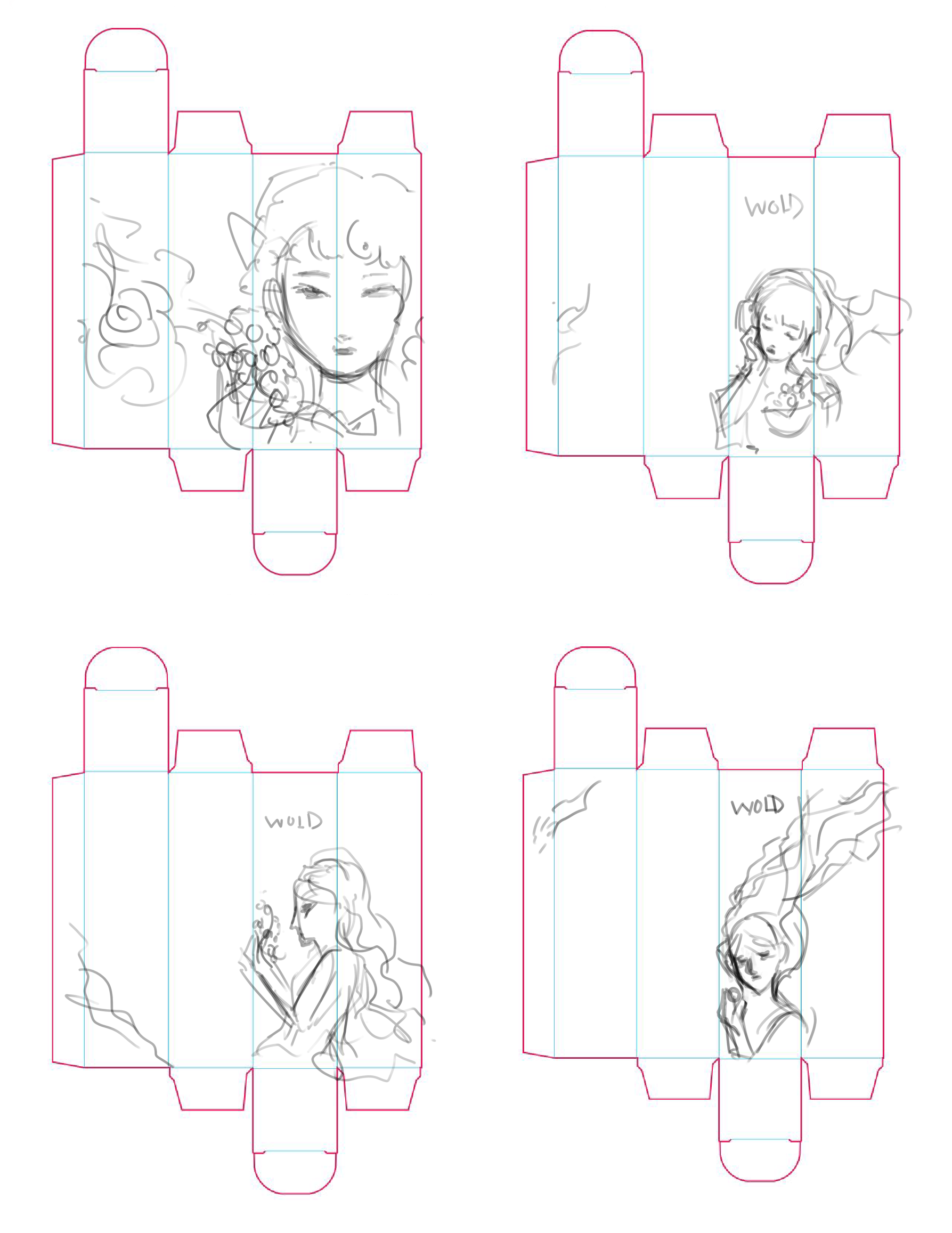
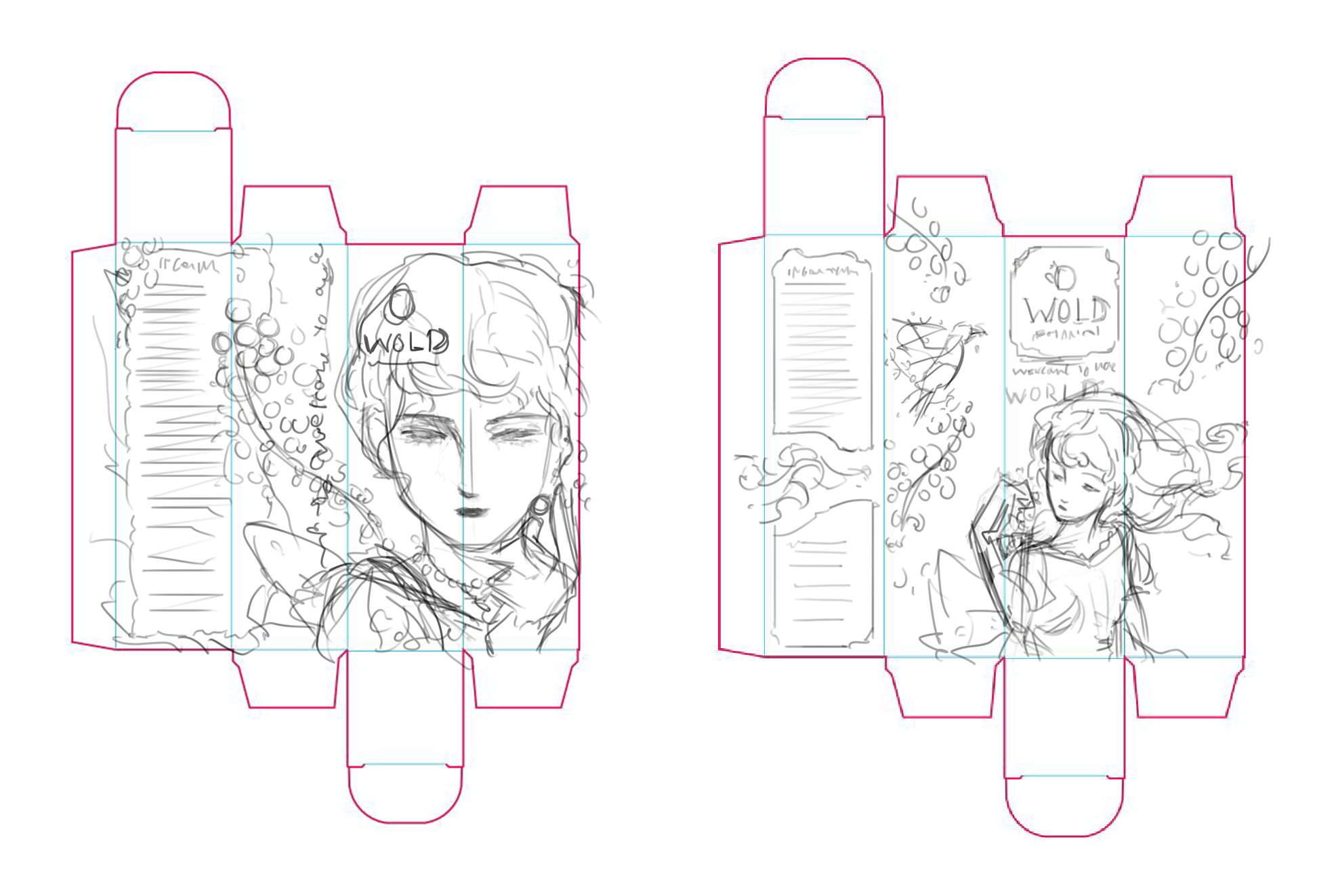
Packaging
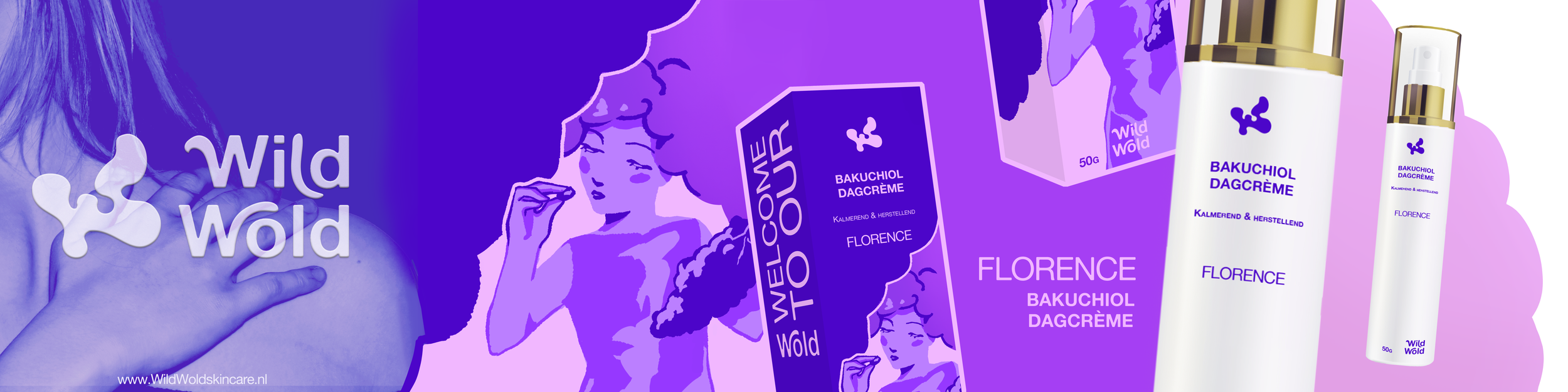
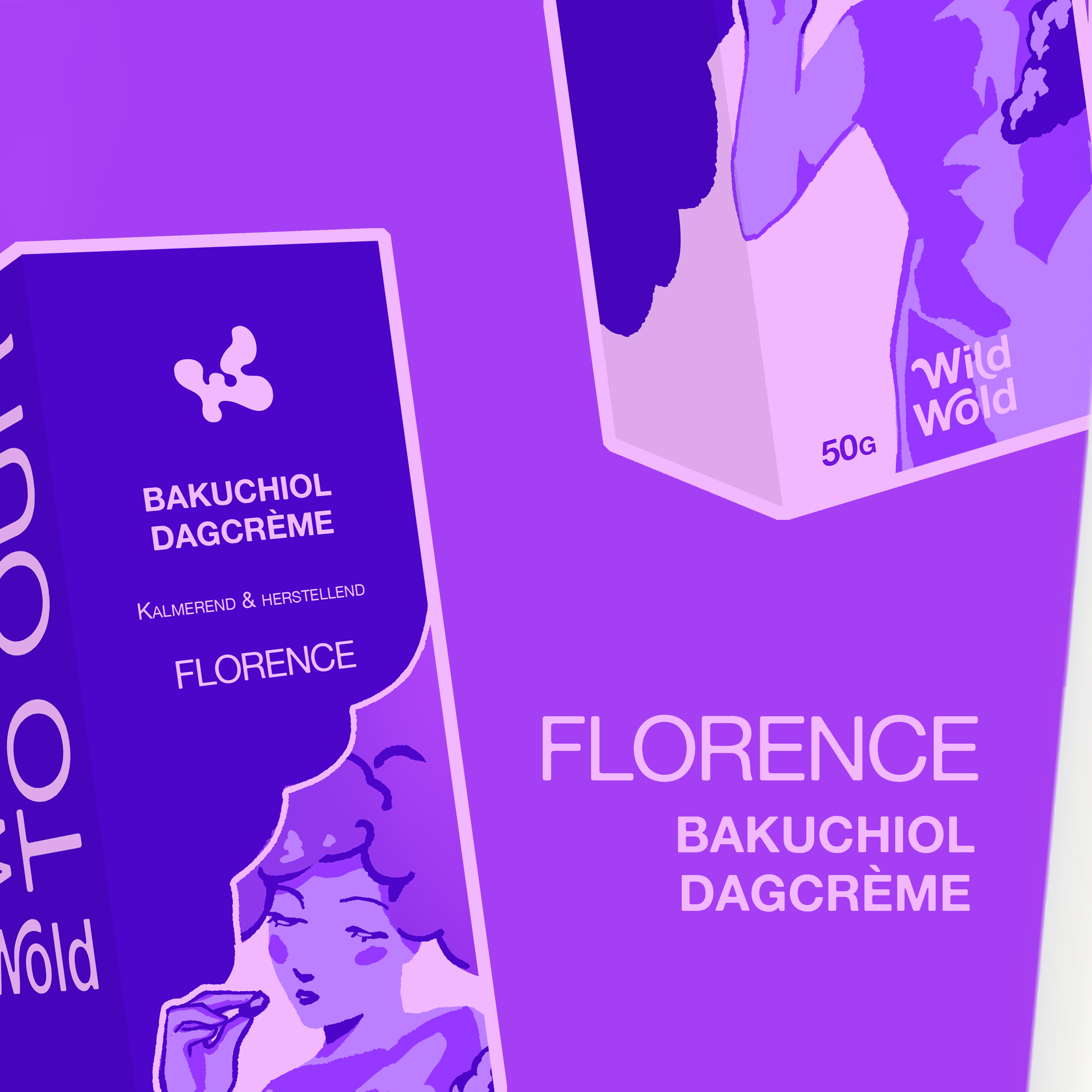
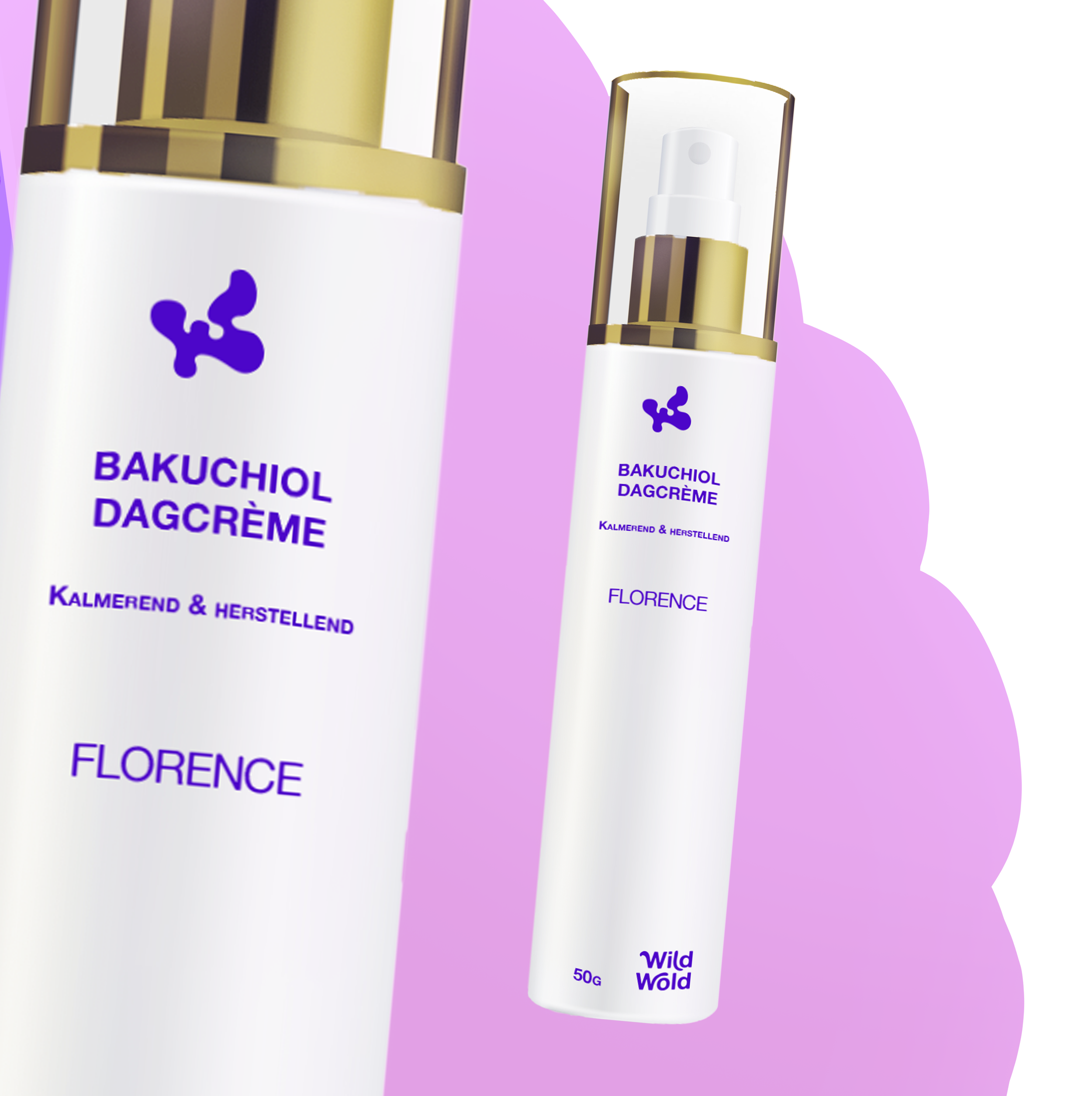
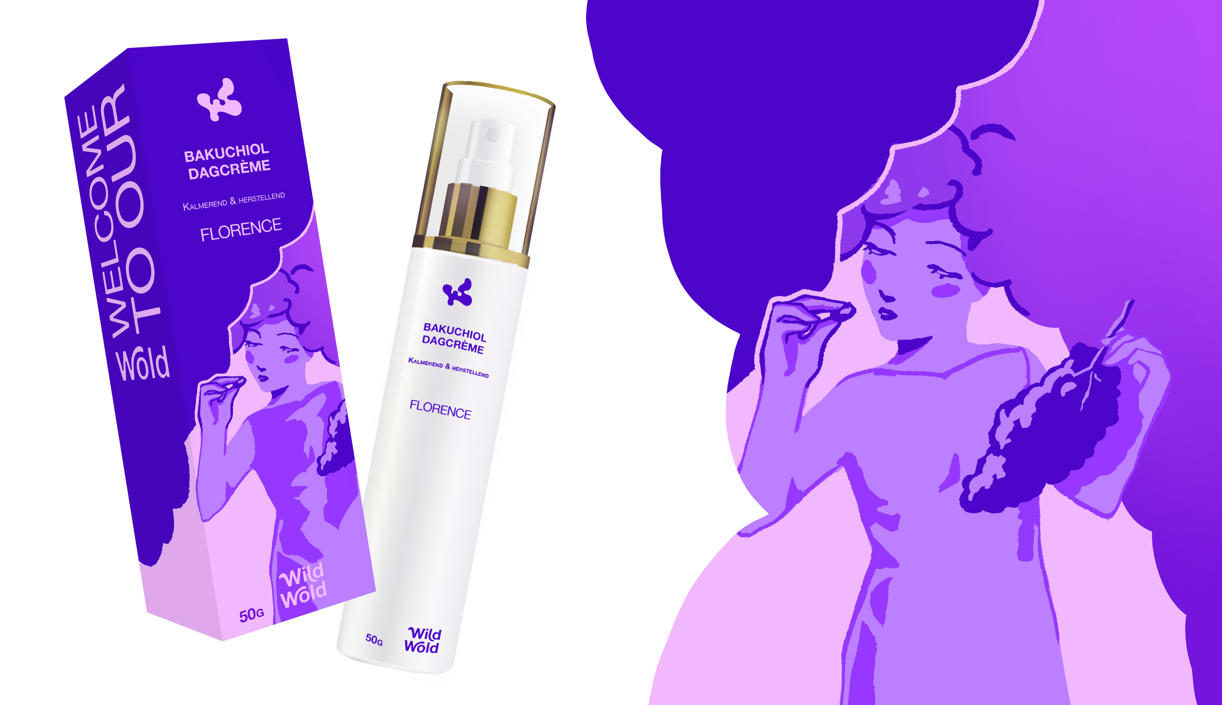
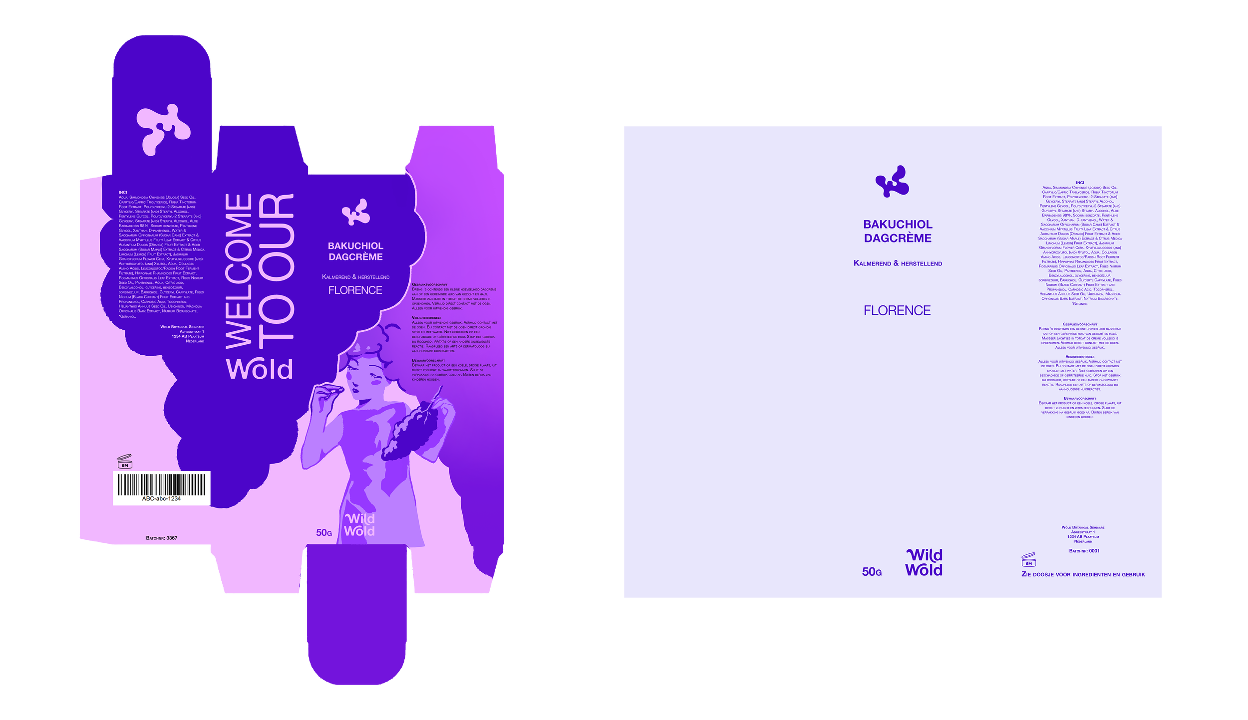
The packaging is designed with a balance of functionality, protection, and a refined luxury feel. The product is presented in an airless pump bottle, which helps protect the formula from air and contamination while ensuring hygienic use and controlled dispensing. This packaging choice preserves the quality and stability of the ingredients and prevents unnecessary product waste.
The design itself remains clean and elegant, with subtle gold accents that add a touch of luxury. The bottle visually connects with the colorful outer packaging, creating a cohesive look while keeping the primary focus on the product and its high-quality formula.
Idea behind Wild Wold
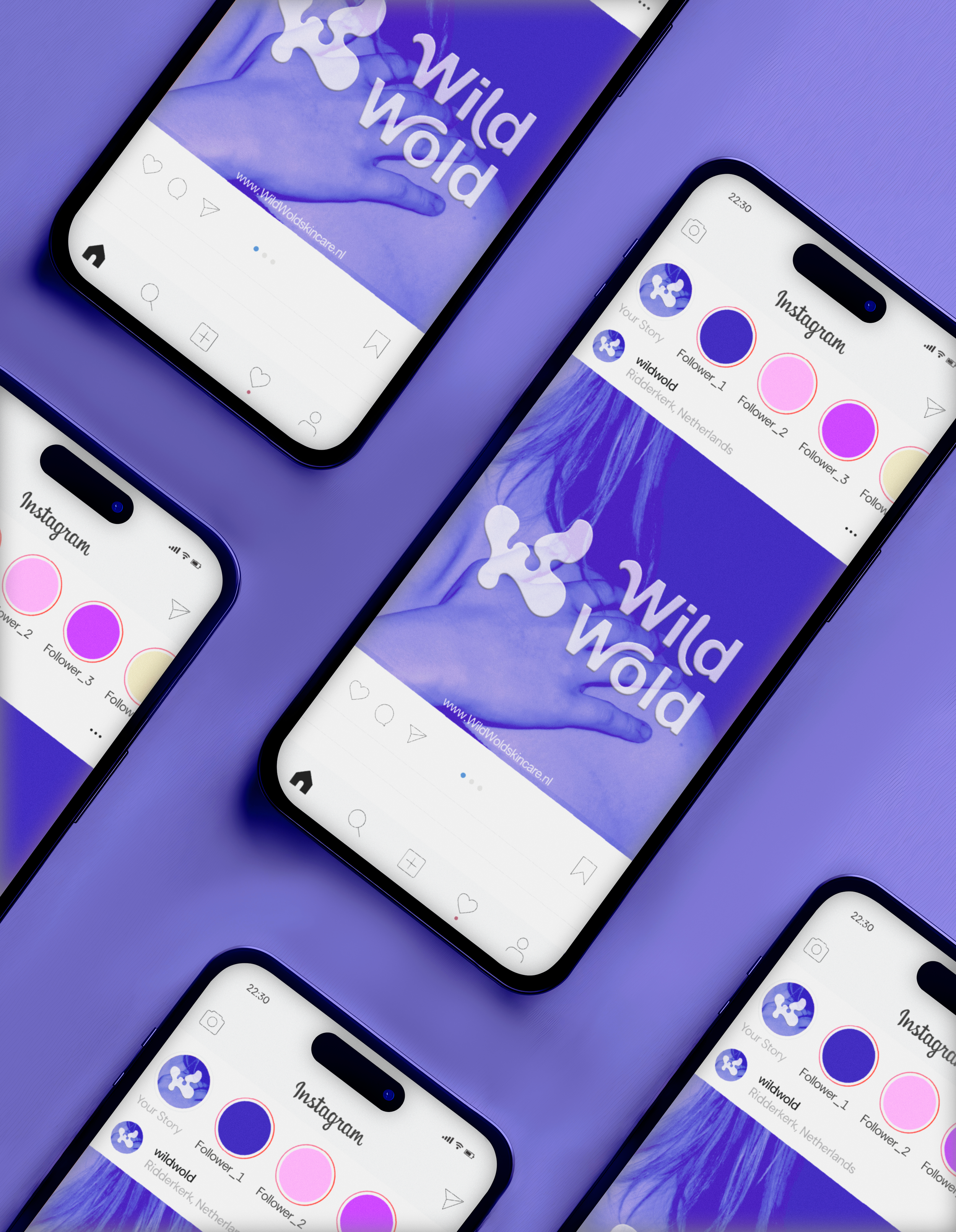
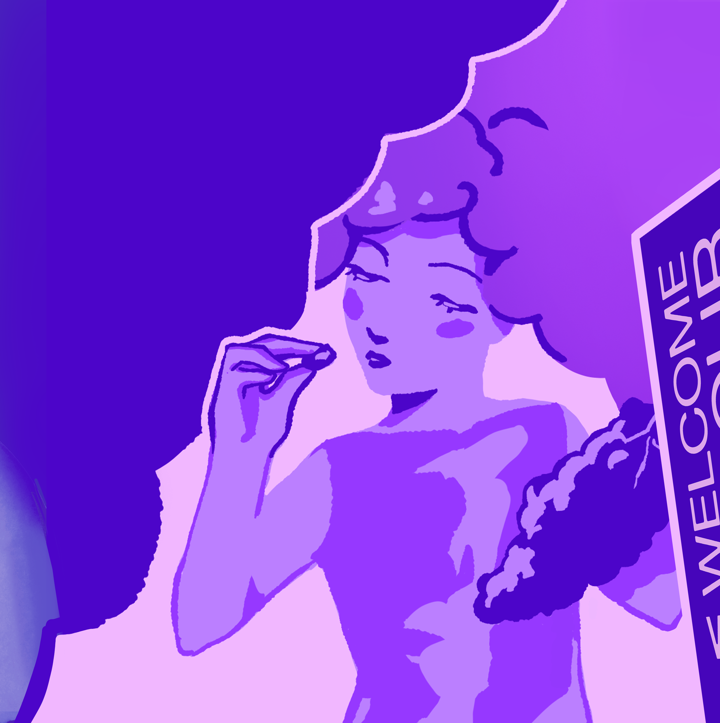
The visual identity of the brand is centered around color, storytelling, and female empowerment. Each product line is represented by a distinct color and illustrated with a dreamy, slightly playful female character on the packaging. These characters are inspired by remarkable women from history who made meaningful contributions to society. By giving each line a unique color and a female name, the products become easily recognizable while also paying tribute to strong women.
The colorful and expressive packaging is designed to stand out from the often minimalistic or clinical appearance of natural skincare brands. As the brand grows, the different product lines will form a full rainbow on the shelf, creating a vibrant and recognizable visual identity that reflects both creativity and individuality.
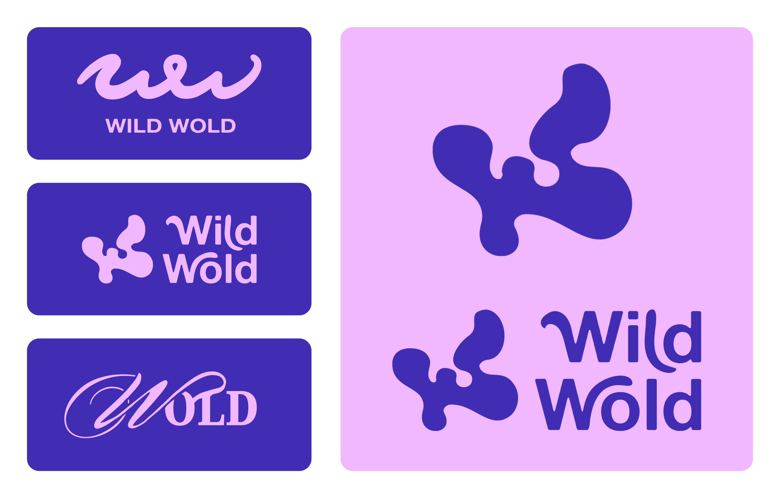
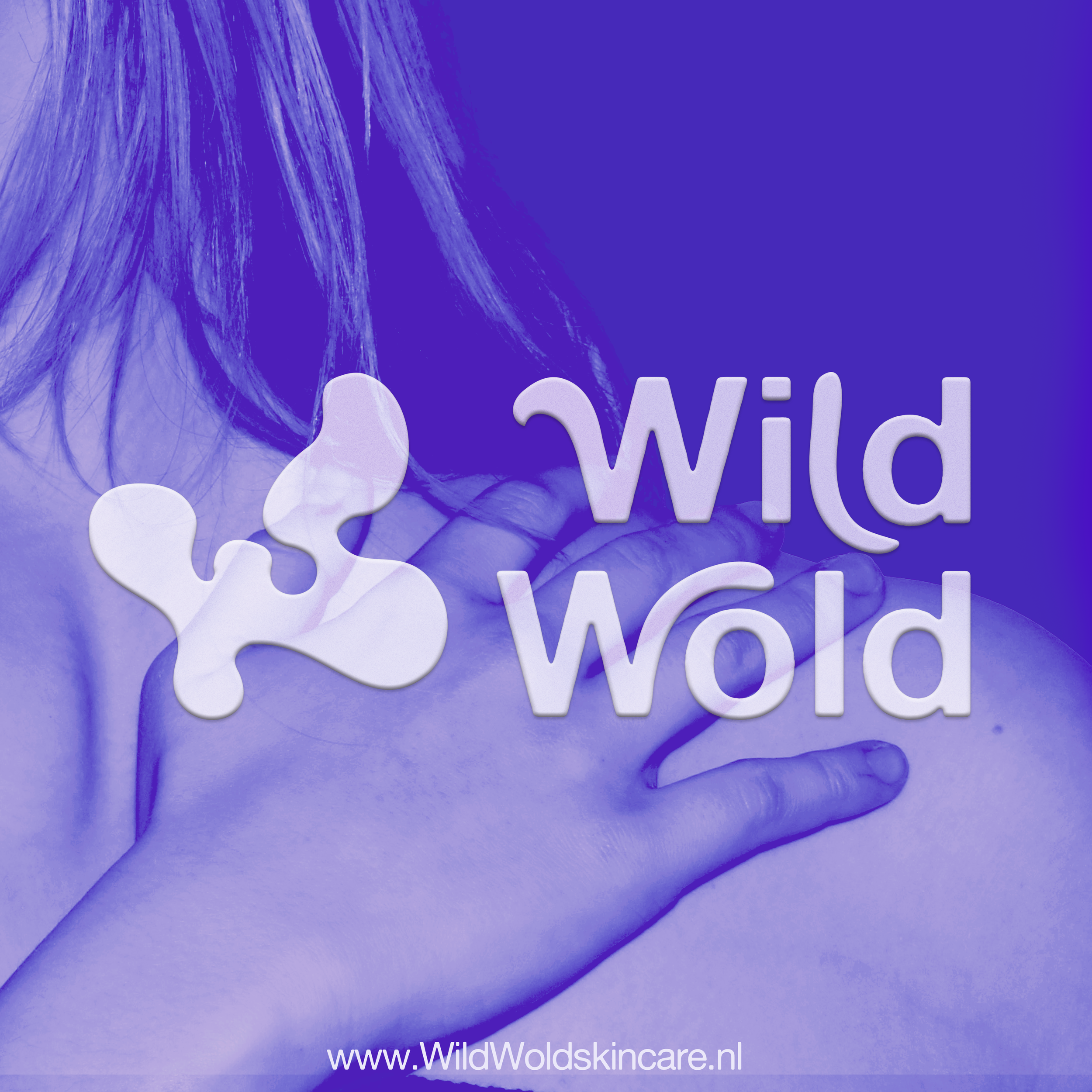
Logo
For the logo, I wanted to focus on giving it an organic look. It needed to be feminine and natural, reflecting the organic ingredients in the product.
The logo is an abstract combination of the letter “W,” a butterfly, and a flower.